Saturday, 11 December 2010

Color wheels and color charts

There comes a time for a hobbyist painter, when he/she needs to do more than copies. Because art is creation, and the imitation of the creations of others can only offer a numb satisfaction; there is always a little voice inside that says you did good but not good enough. 

What happens if you don't know how to overcome that wall? What if you've obtained the possibility to sketch, and you want to put a sketch in color? Books come in handy then. So do color wheels!

There are numerous books, instructing how to set a composition. The ways to balance it, which angles to draw it from, the direction from which you can lighten it. That's not what I'm trying to explain. 

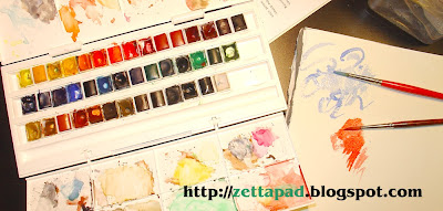
When you open a palette, like my Winsor & Newton watercolor half-pan, colors look flat to your inexperienced eye (if you're a professional, I assume you've already understood that your skills have surpassed this article looong ago). A red paints red, a yellow is just the different shades of yellow that you see in the palette; but how to mix them?


What I've found REALLY helpful, and necessary to be able to paint in a way that I can control what are the colors I'm using, is this chart below.


I think it took me equal patience and time to finish it but I never paint without taking a look at it. Surely, with time, experience teaches you what you get after mixing crimson with ultramarine instead of cadmium red with ultramarine. But the palette has many colors and it's rather impossible to remember all the different shades you can get. So, if while I'm painting, I'm trying to decide which type of green would be more suitable for my trees (ah! those greens), my chart is there to come to the rescue. 


In addition, the following color wheels are also useful, but I must be honest. I had made them before the chart and I only use them for comparison between color temperatures any more.


So go ahead. Make your own chart, however detailed or not, and enjoy the splendor of color!

Friday, 10 December 2010

Teachers and learners

I used to think that a painter is made only through some teacher; the better teacher you could find in a school, or wherever else, the luckier you were. I still believe the second part of this phrase to be true.

It seems to me after so many years that the basic concept of drawing, is to perceive what you see. To study what you see. Then to try to see it clearly, try to see it from the outside. But if you try, try, try, then you can get somewhere. As it happens with everything, a teacher will show you, but your constant effort is what will lead you where you want to go.

And as for the teachers, well, they can be found everywhere. Like in the overloaded bookshops for instance. Not all books are good, but some of them are. Now if you give them some time, some of your time, they will teach you something. Something new every time. A technique about color, about shape, about light. The real treasure is hidden in some books that don't even mean to be instructive. But to these I will mention in another post.

I post below a sample of pages from the book of Ms. Linda Ravenscroft named "How to draw and paint fairies".


And that's because I include the sketch that it inspired me to make. It was a study, worked rather rapidly, and looking at it I think that I paid more attention to the leaves than to anything else. But as I said, I learned things by making it.

My sketch (apparently!)

You can visit the following link if you want to access two fairy art tutorials that Mr. Raverscroft supplies free on her website:  Linda Raverscroft Fairy Art Tutorials.
It's worth a tour, her sketches are surely enchanting.


Tuesday, 7 December 2010

Displeasure


Here is an acrylics' painting that I recently made (70x50cm). It is basically a copy and I've kept the elements I liked (posture, expression, colors) and removed some that I didn't (some womanly figures resting here and there).

I can't decide whether my clown looks sad or bored; if it is sadness, it seems to be the childish kind. It never makes me sad when I look at it, though; I simply enjoy the brilliance in the choice of colors by the original artist (I think it was Red Skelton).